

|

|

Philatelic PhotoShopping Phun
Click Linked Pictures for a Larger View
I can't draw.
That's a major handicap for a cachetmaker! But I have an eye for art, and I can put elements together.
When I first began Dragon Cards in 1983, I relied on photocopiers and rubber cement to put together the masters for the printer.
Then, both personal computers and eventually myself, advanced to graphic arts software. I first used Paint Shop Pro and now PhotoShop Elements.
The artwork for Dragon Cards is now "PhotoShopped." And it opens up whole new possibilities, particularly when working with old photos and documents found in the Library of Congress.
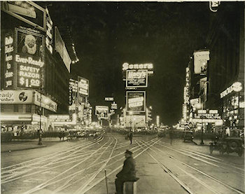
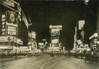
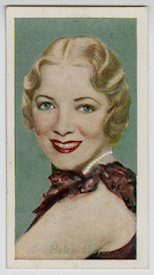
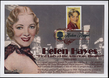
For the Helen Hayes stamp last year, I found a 1923 photograph of Times Square (Broadway, 42nd Street and Seventh Avenue), when Hayes had several roles on the Great White Way. But I didn't want that man sitting on a crate in the middle of the intersection (#1). In the version used for the background of my Dragon Card, he's gone (#2). I then flipped a 1939 promotional card of Hayes (#3) to create the final design (#4 - Click for a Larger View).
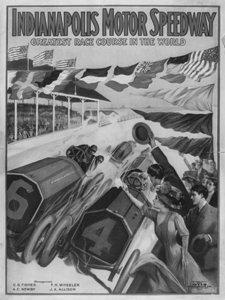
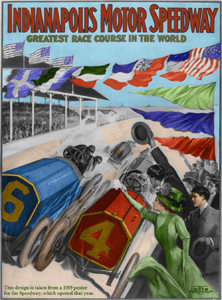
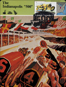
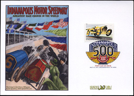
The Library of Congress website provide a black-and-white picture of an Indianapolis Motor Speedway poster from 1909 (#1). Using PhotoShop Elements, I "tinted" it so that it resembled an early color postcard (#2). Later, VSC member Frank "Fallston" Kohut showed me a modern card made from a color version of the postcard, which may show the poster's original colors (#3). I like mine better (#4 - Click for a Larger View).
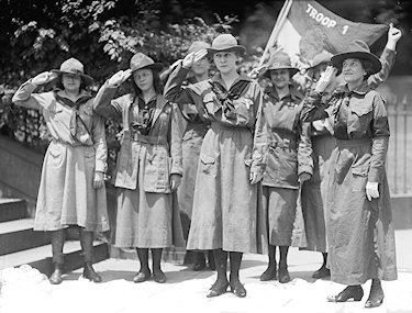
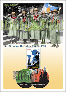
Speaking of tinting, there are several photographs in the Library of Congress of Girl Scouts and their leaders visiting the White House in 1917, five years after the organization's founding in this country (#1). I'm using one for the Dragon Card for this year's "Celebrate Scouting" stamp (#2 - Click for a Larger View).

#1 |

#2 |
Finally, for last year's Jazz stamp, an abstract design, I found abstract art of jazz music that I liked, but it didn't quite fit the 5- by 7-inch (really 4½- by 6½-inch) design size I use (#1). You can see its evolution as I extended the background on the right (where the stamp and cancel would go), changed one of the colors, and, finally, added a trombone (because I play trombone). The result came out well, I think (#2 - Click for a Larger View).

#1 |

#2 |
I still can't draw, and I'll never be a professional artist like my Great-Aunt Bep. But I'm having fun, and I think the Dragon Cards designs have come a long way from the line art I photocopied out of books.
Click Here For More FDC Fun
Lloyd A. de Vries
©2012 de Vries Philatelic Media
Virtual Stamp Club Home Page
|


